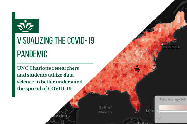
Visualizing The COVID-19 Pandemic
As the United States battles a drastic resurgence in coronavirus cases, a group of UNC Charlotte researchers aggregated, analyzed and visualized publicly available COVID-19 data to produce an interactive dashboard in order to better understand the rapid spread of the virus.
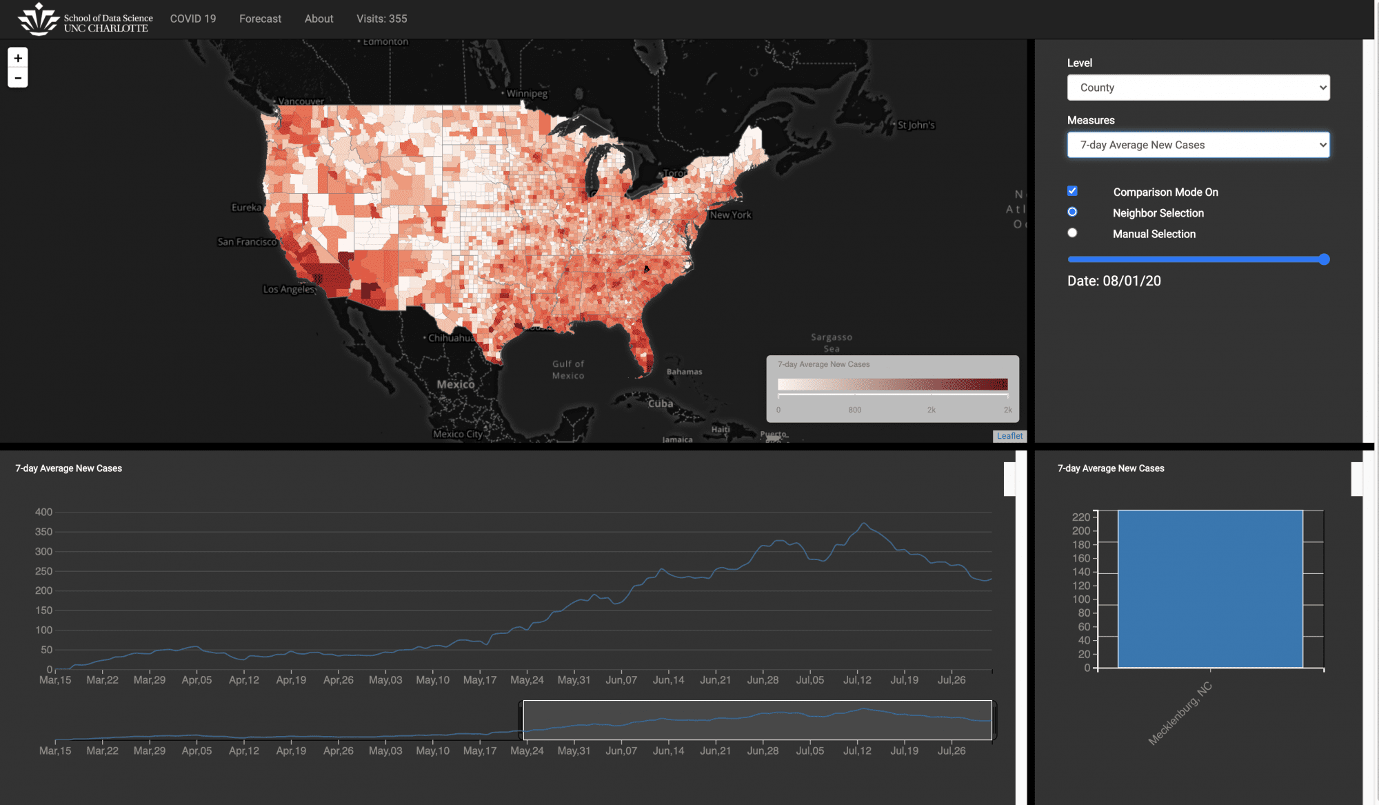
The project, facilitated by UNC Charlotte’s School of Data Science, was funded by a $27,000 grant gifted to the school by a Fortune 500 Financial Services company with a strong presence in the Charlotte community. Employing U.S. state and county level data on COVID-19, the interdisciplinary research team measured new and total cases, new and total deaths, seven-day average of new cases and duration spent at home from March 18th through August 5th. The dashboard utilizes a statistical technique and geospatial computational algorithm to identify “clusters” and infection hotspots and coldspots throughout 3,600 counties across the country.
“Mapping this data over a number of weeks has allowed us to visualize the relationship between the geographic patterns of hotspots and coldspots and the geographic patterns of social distancing,” said Jean-Claude Thill, a UNC Charlotte economic geographer and collaborator on the project. “This unique feature uncovers valuable information for government leaders and public health officials to determine where social distancing efforts have been successful, and where additional measures are needed to reduce the spread of the virus.”

University collaborators on the project include:
-
Rajib Paul: Associate Professor, Department of Public Health Sciences, CHHS
-
Shi Chen: Assistant Professor, Department of Public Health Sciences, CHHS
-
Jean-Claude Thill: Affiliate Professor, Department of Geography, CLAS
Graduate and Ph.D. student collaborators include:
-
Atefeh Mahdavi Goloujeh: Currently obtaining a Ph.D. in Computing and Information Systems
-
Nicole Kniep: Currently pursuing a master’s degree in Health Informatics & Analytics.
-
Faizeh Hatami: Currently pursuing a Ph.D in Geography and Earth Sciences.
-
Homeira Azari: Currently pursuing a master’s degree in Data Science and Business Analytics.
The success of this project could lead to increased funding opportunities for SDS students and University faculty and researchers as they employ data-driven approaches in efforts to address the world’s most pressing challenges.
The dashboard will continue to collect and visualize data throughout the course of the pandemic and will be available for public interaction on the SDS website, here.